
This tutorial was written by Katherine Walden, Digital Liberal Arts Specialist at Grinnell College.
This tutorial was reviewed by Sarah Purcell (L.F. Parker Professor of History) and Gina Donovan (Instructional Technologist) at Grinnell College, and edited by Papa Ampim-Darko, a student research assistant at Grinnell College.
![]() Analyzing Data (Excel and Tableau) is licensed under a Creative Commons Attribution-NonCommercial 4.0 International License.
Analyzing Data (Excel and Tableau) is licensed under a Creative Commons Attribution-NonCommercial 4.0 International License.
Table of Contents
Analyzing Data in Microsoft Excel
For this exercise, we’ll be working with Grinnell Township census data again, like we did with the ArcGIS Online exercise. This time, we’ll use data from the 1870s Federal Census.
A note on platform: Excel is a tool that can differ substantially across versions, such as the desktop versions for Windows and Mac and the web-based versions. The tools and menus shown below should be standard across versions, but they may not be located in the same spot, look the same, or have the same behavior. Some experimentation and consultation of resources specific to your machine may be necessary.
Getting Started
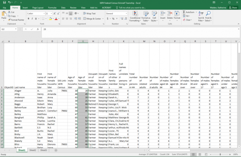
Download this 1870 Federal Census Grinnell Township file in a browser and open it in Microsoft Excel.
Save the 1870 Federal Census Grinnell Township file to your Desktop. Microsoft Excel includes a wide range of data analysis tools that require minimal specialized technical knowledge.

Select Values & AutoSum
To calculate the number of females ages 5-17, select all the cells with values in them in column T (“Number of females aged 5-17″ – don’t select the entire column, just the cells with values), and click the AutoSum icon.
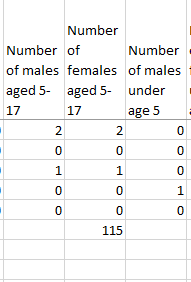
Excel has calculated the sum of the values in your selected cells. The result (115) is printed in the bottom cell, cell T163.
Pro Tip:
Excel has many keyboard shortcuts that allow you navigate and perform operations without moving the mouse. For example, to complete the steps above, you could have selected cells with values in a column using Control+Shift+Down Arrow and then summed their contents using Alt+ = (Windows) or Command+Shift+T (Mac). (Note that columns with empty cells will require multiple Control+Shift+Down’s to select all filled cells, because technically this keystroke only selects filled cells up until the first break.)
You might find that you prefer using keyboard. They often vary from Windows to Mac: browse the most commonly used shortcuts.
Average
The AutoSum function defaults to calculating the sum of selected cells, but it can also perform other mathematical calculations.
To calculate the average age of female householders, select the values in column G (“Age of female householder”) and click the arrow next to the AutoSum icon.
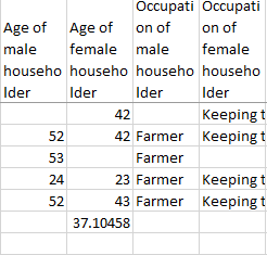
Select Average to calculate the average value for your selected cells. The result (37.10458) is printed in cell G163 below the selected data values.
Explore the AutoSum functions with other data fields. How do these calculations impact or inform your understanding of the data? What questions do you have about the data or calculations?
Data Visualization with Microsoft Excel
We’ll use the same 1870 Federal Census Grinnell Township file to build preliminary data visualizations in Microsoft Excel. Navigate to https://sarahjpurcell.sites.grinnell.edu/digital_methods/files/1870_Federal_Census_Grinnell_Township.xlsx in a browser if you need to download the file again.

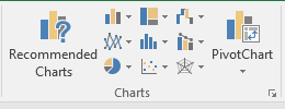
Insert Pivot Chart
Start in cell A1 and select all cells in the sheet that contain data: you can do this by clicking the triangle icon in the top left corner of the spreadsheet or by hitting Control-A (Windows) or Command-A (Mac). Click Insert-> PivotChart.
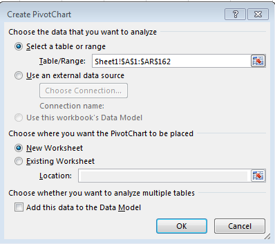
Leave the default selections in the pop-up window and click OK.

Your data is now formatted as a PivotChart sheet, which will allow sorting, filtered searching, and visualization.
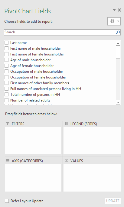
The PivotChart side bar allows you to select specific data fields and arrange or restructure them to generate visualizations.
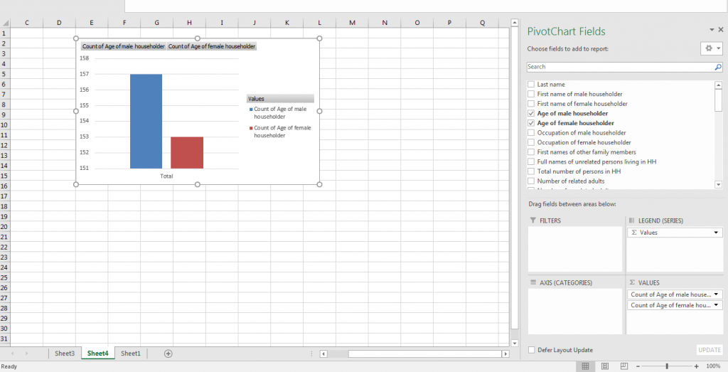
To compare the average age of male and female householders, click and drag both Age Fields into the Values box. You can search for fields using the search bar at the top of the side bar.
The default Value and bar chart is showing us a count of the number of data points represented in each field.
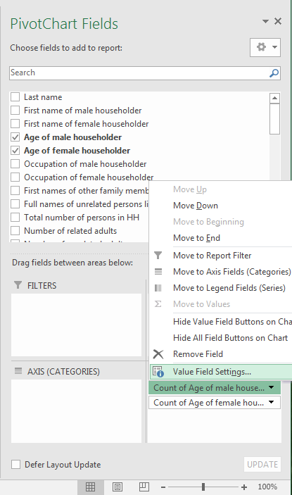
Click on the arrow next to a field in the Values box and select Value Field Settings. (On a Mac, right click on the field and select Field Settings.)
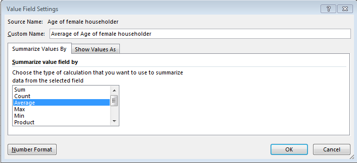
Click Average to have Excel calculate the average value for those data points.
Make this change for both fields.
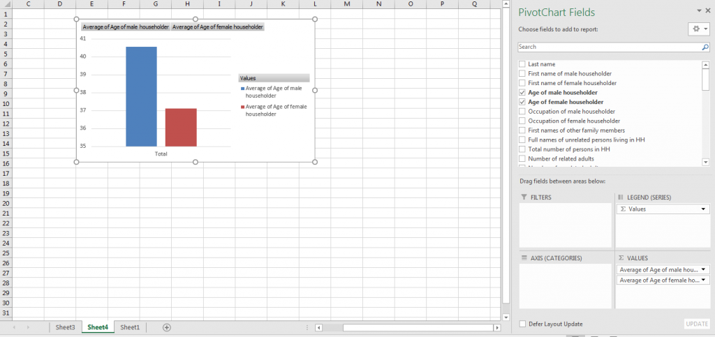
We now have a bar chart that compares the average ages of male and female householders.
You can right click on various parts of the bar chart to customize colors and labels.
Experiment with other PivotChart functions and other data fields to generate different types of visualizations.
What types of visualizations were you able to generate in Excel using PivotChart? How could those visualizations shape or impact your understanding of the data? Did you generate any visualizations that were confusing or misleading? Alternatively, did you generate any visualizations that were unexpected or illuminating?